Access for everybody
With a brand evolution, it’s critical to keep the future in mind at all times. When Access Mammoth partnered with Miley Studios, the challenge was clear: to keep clarity, accessibility and a viable runway for long-term growth in mind.
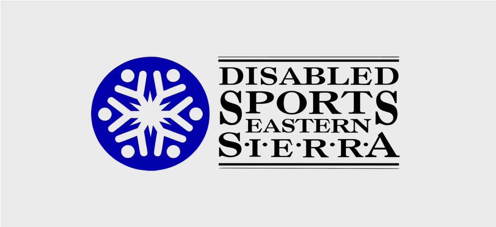
Formerly known as Disabled Sports Eastern Sierra, the accessible outdoor sports organization needed more than a simple refresh. The project called for a new name, a clear brand strategy and an accessible website that expanded participation, removed barriers and reflected the full scope of its mission. All without sacrificing trust or recognition.
Miley Studios led a full nonprofit brand transformation, including renaming, brand strategy, visual identity design and the development of an ADA-compliant, performance-focused website. Every decision prioritized usability and real-world application, ensuring the brand worked seamlessly across digital, print and in-person environments.
Through discovery, three strategic opportunities shaped the work:
- Unify under a clear, inclusive brand identity
- Modernize the visual identity for flexibility and scale
- Build long-term brand recognition across all channels
A new name that opens doors
Renaming the organization marked the most consequential chapter in the brand’s history. The shift from Disabled Sports Eastern Sierra to Access Mammoth needed to signal inclusion, ease of recognition as well as momentum without narrowing who felt welcome or how the organization could grow.
In other words, it had to speak to every body, regardless of skill, experience or ability.
Miley Studios led a collaborative brand naming process grounded in research and real-world insight. We formed a cross-functional brand committee and gathered input through surveys, interviews and audience research across participants, volunteers, donors and partners. That work revealed a clear tension: the existing name accurately described programs, but it unintentionally defined people by limitation rather than possibility.
The new name needed to do more than label the organization. It needed to expand participation, remove assumptions and scale alongside the mission.
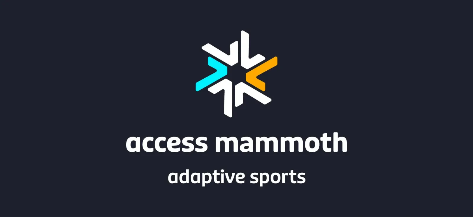
Access Mammoth emerged as a name built for inclusion and the long run. It places access as a central, shared value rather than a qualifier, while the reference to Mammoth roots the organization in community and outdoor experience. The result is a clear, welcoming name that supports growth across programs, partnerships and audiences.
The naming strategy aligned stakeholders, clarified purpose and established a foundation strong enough to support everything that followed, from brand messaging and visual identity to digital experience and outreach.


Strategy before execution
With the new name in place, Miley Studios developed a brand platform to give Access Mammoth clarity and direction across every touchpoint. The platform defined audience, purpose, voice and positioning, creating a shared framework the organization could use to make consistent, confident decisions.
This strategic foundation aligned internal teams while simplifying messaging and ensuring the brand showed up clearly and cohesively across design, content and real-world experience. Instead of reacting project by project, Access Mammoth gained a system that could guide growth over time.

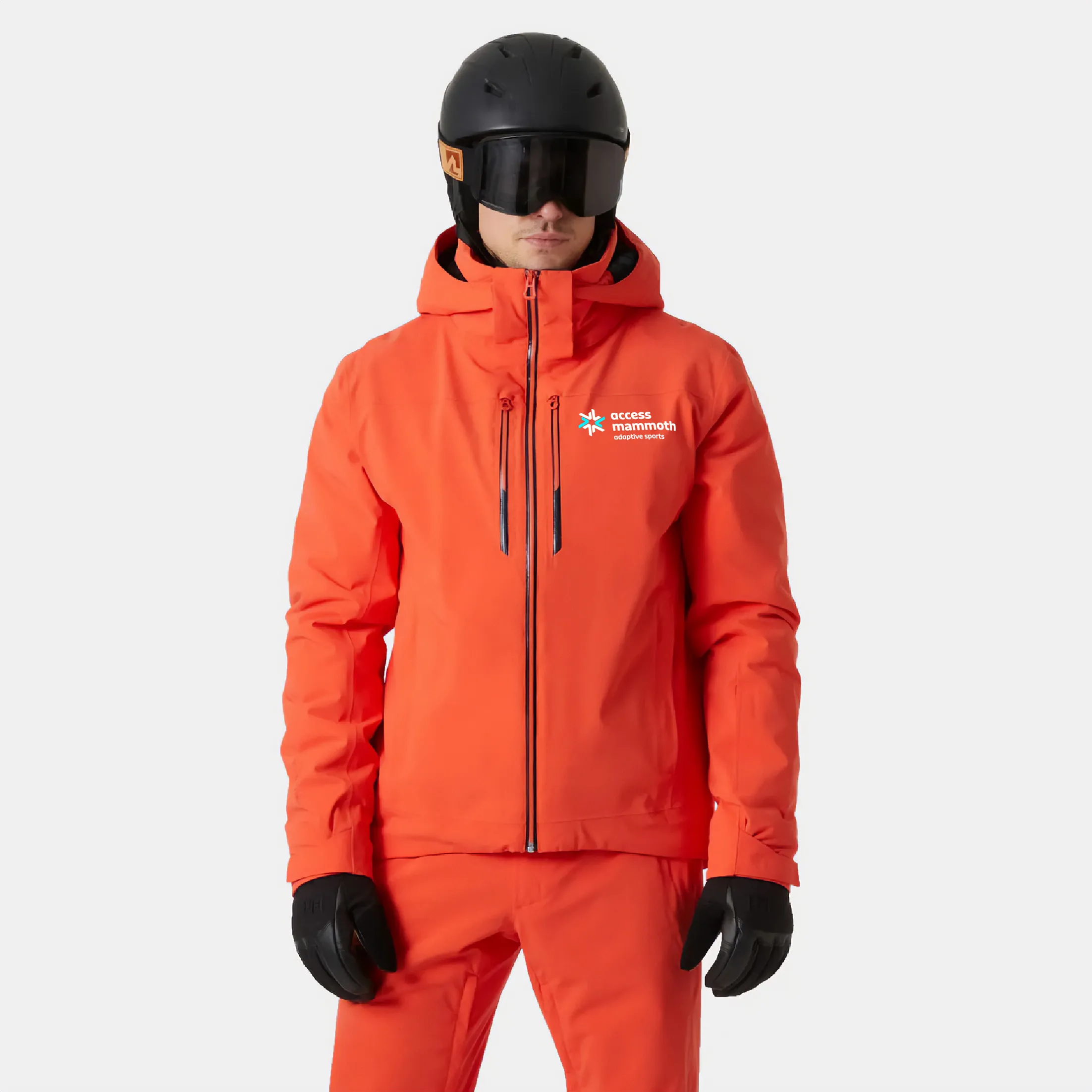
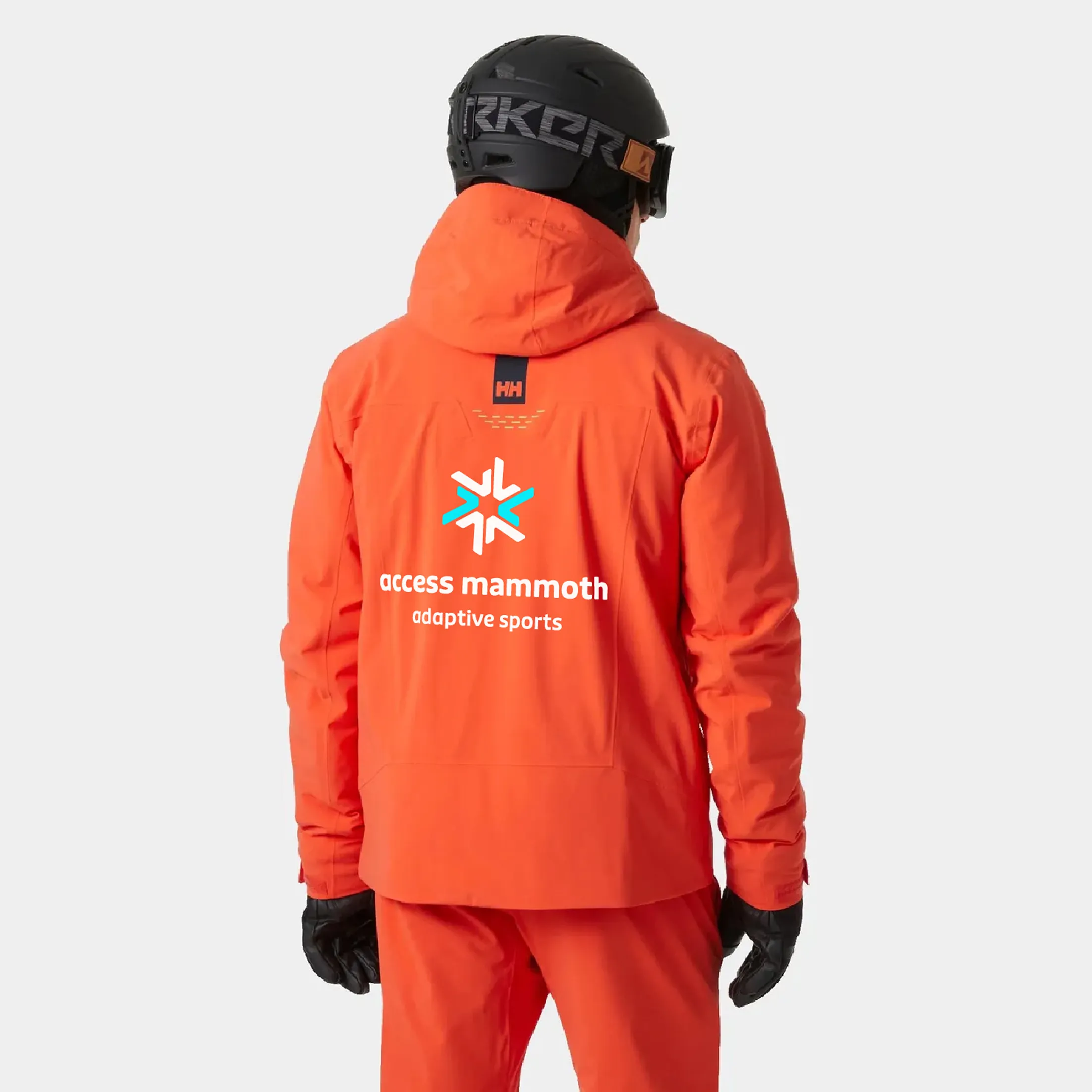
A visual identity with unity
Miley Studios designed a visual identity that is bold, approachable and, most importantly, flexible. It is one that reflects the diversity of Access Mammoth’s programs while holding together as a single, recognizable brand.
The logo system anchors the identity with clarity and confidence, while a vibrant color palette assigns distinct combinations to major program areas. This structure allows each program to stand on its own without fragmenting the brand, creating instant recognition across audiences, seasons and environments.
The result is a visual system that brings energy and personality to the brand while remaining quite practical. It adapts easily across digital, print, apparel, and environmental applications, giving Access Mammoth a cohesive look that scales with its mission.
A rallying cry for all
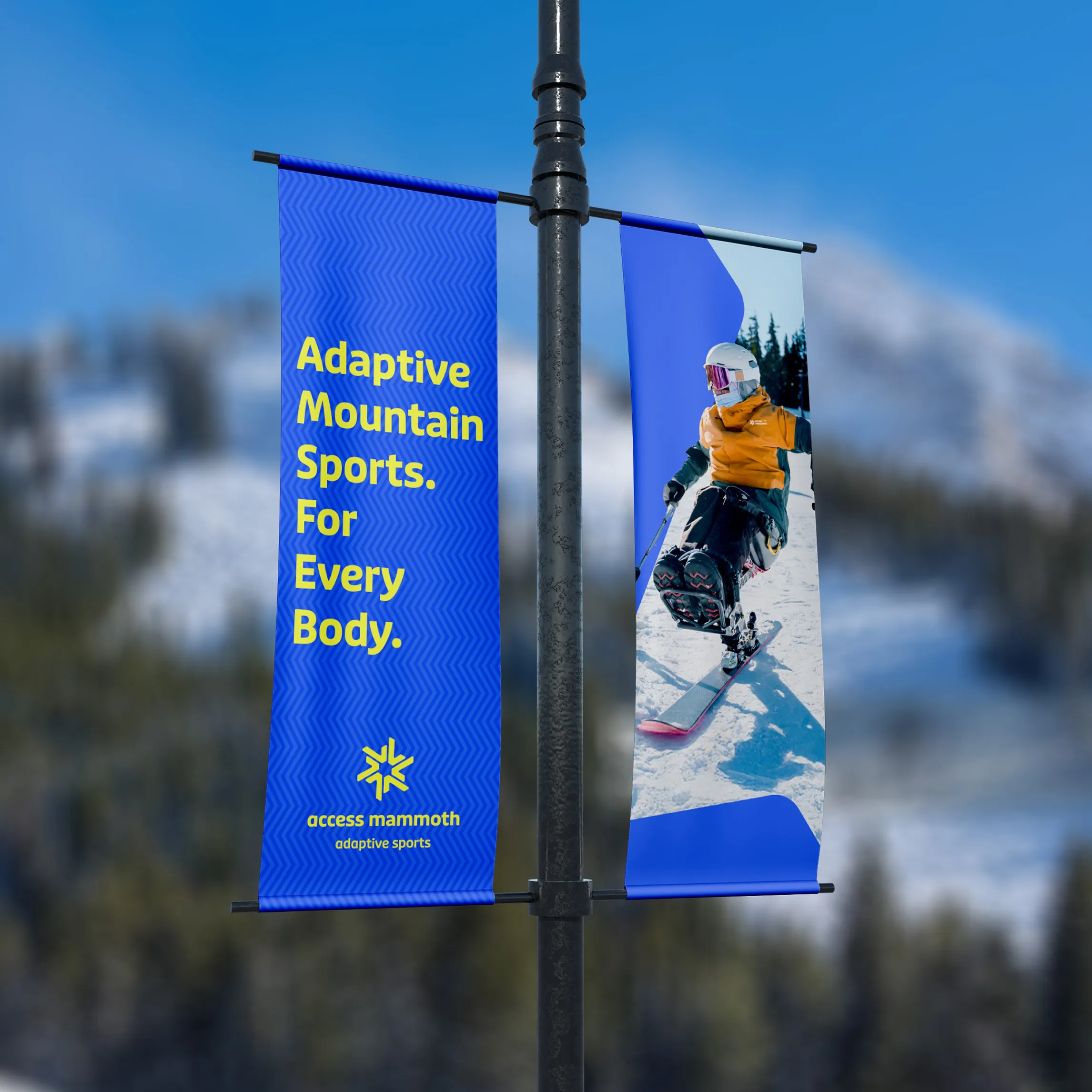
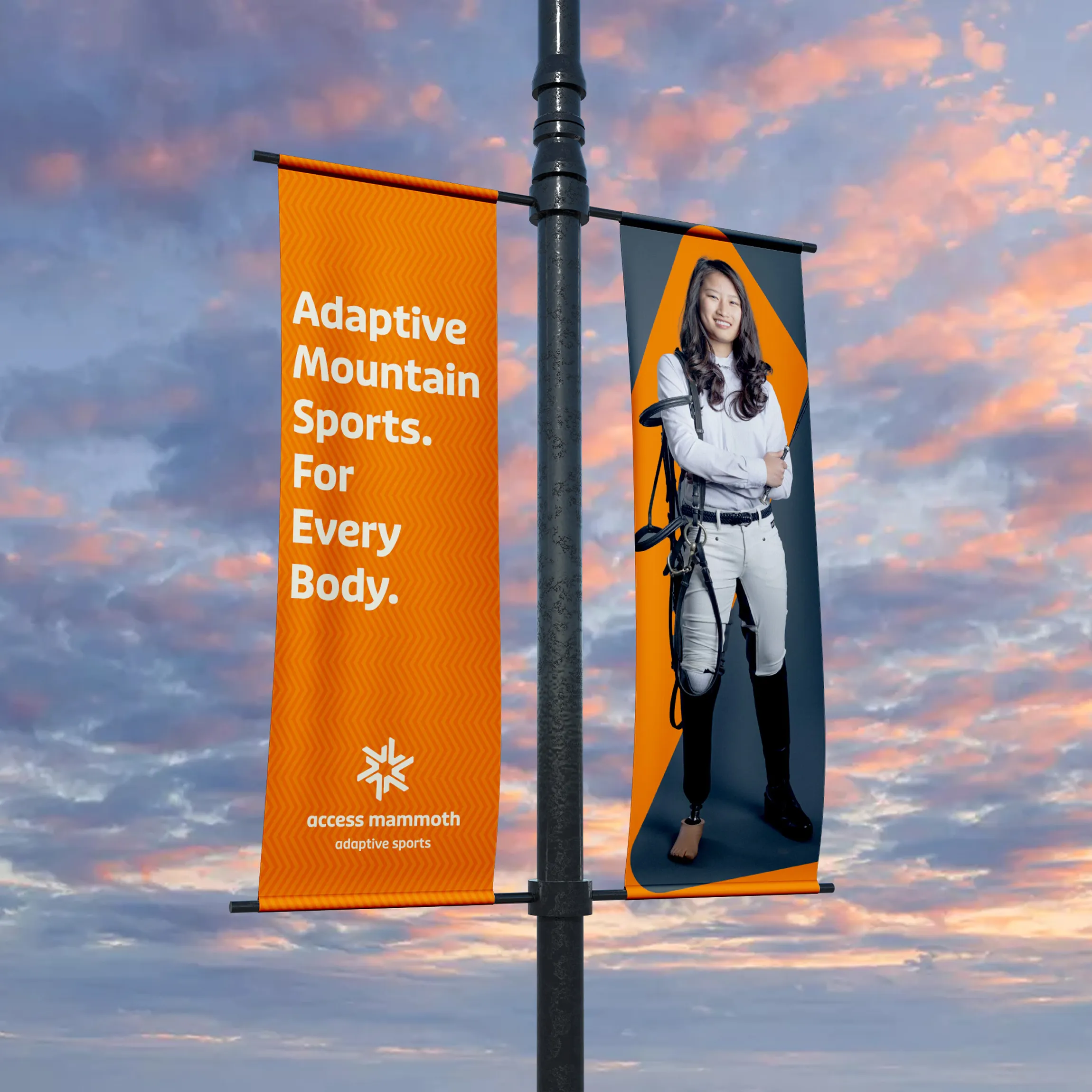
Miley Studios developed a rallying cry to give the brand a clear, human center: “Access-ability for every-body.”
The phrase reframes access as both an organizational commitment and a shared belief. It underlines that Access Mammoth exists to welcome, support and empower people of all abilities, without exception or qualification.
It works across messaging, campaigns, apparel and community outreach, giving the organization a unifying idea that people can easily recognize, repeat and stand behind.


A website built for access and performance
Miley Studios designed and built a custom website with a single goal: to make access effortless for every user.
The site delivers an ADA-accessible, performance-driven experience that emphasizes clarity, intuitive navigation and ease of use across devices and abilities. Clear pathways guide users to the information they need, quickly and without friction.
Miley Studios also partnered with Salesforce to support a custom volunteer portal with direct Salesforce integration. The system streamlines sign-ups, onboarding, event registration and communication, while an integrated events calendar and flexible content tools give the internal team full control as the organization grows.
The result is a digital platform that removes barriers for users and simplifies operations behind the scenes.
A system built to adapt
Miley Studios built a brand system that balances consistency with flexibility. This gives Access Mammoth a clear visual and verbal language that holds together while adapting to different needs.
Typography, color, layout and messaging work together to make the brand easy to apply across platforms and environments. Wherever the brand appears, it remains recognizable, cohesive and confident.
This system empowers the internal team to move quickly without sacrificing clarity, ensuring the brand can evolve and scale while staying grounded in its core identity.


Bringing the brand into the world
Miley Studios extended the Access Mammoth brand beyond the screen through apparel and swag designed for everyday use and visibility.
Each piece reinforces the rallying cry and visual system while staying approachable. Rather than feeling promotional, the assets feel worn-in and authentic.
These touchpoints help build awareness, strengthen community pride and create consistent recognition. In the end, the brand is designed to move where it needs to and with the people who support it.


Impact and outcome
Beyond just a new look, the brand transformation gave Access Mammoth organization momentum to carry forward.
Easier volunteering, real growth
The Salesforce-integrated volunteer portal removed friction from the entire process. Volunteers can now sign up, onboard, register for events and receive updates in one streamlined experience. As a result, volunteer registrations increased by 42%, and event sign-ups became more consistent and easier for staff to manage.
One brand, finally working together
A unified brand system brought cohesion across programs and initiatives, including the Second Chance Thrift Shop and multiple organizational groups. The new name and brand platform gave staff, volunteers, donors, and participants a shared identity they could understand and trust.
A website people will actually use
Replacing a largely image-based, hard-to-navigate site with a clear, accessible and search-friendly experience delivered measurable results:
- Website traffic increased by 68%
- Organic search traffic grew by 85%
- Average time on site improved by 47%
Clear pathways now guide donors, volunteers, participants and staff to the right information faster, helping people take action instead of getting stuck.
Together, these outcomes position Access Mammoth for sustained growth, stronger visibility and deeper community impact. Access Mammoth now has a brand and digital foundation built to support what comes next.
Related Projects
Let’s build your next big brand move
Partner with an award-winning creative team blending strategy and craft to move your brand forward.
