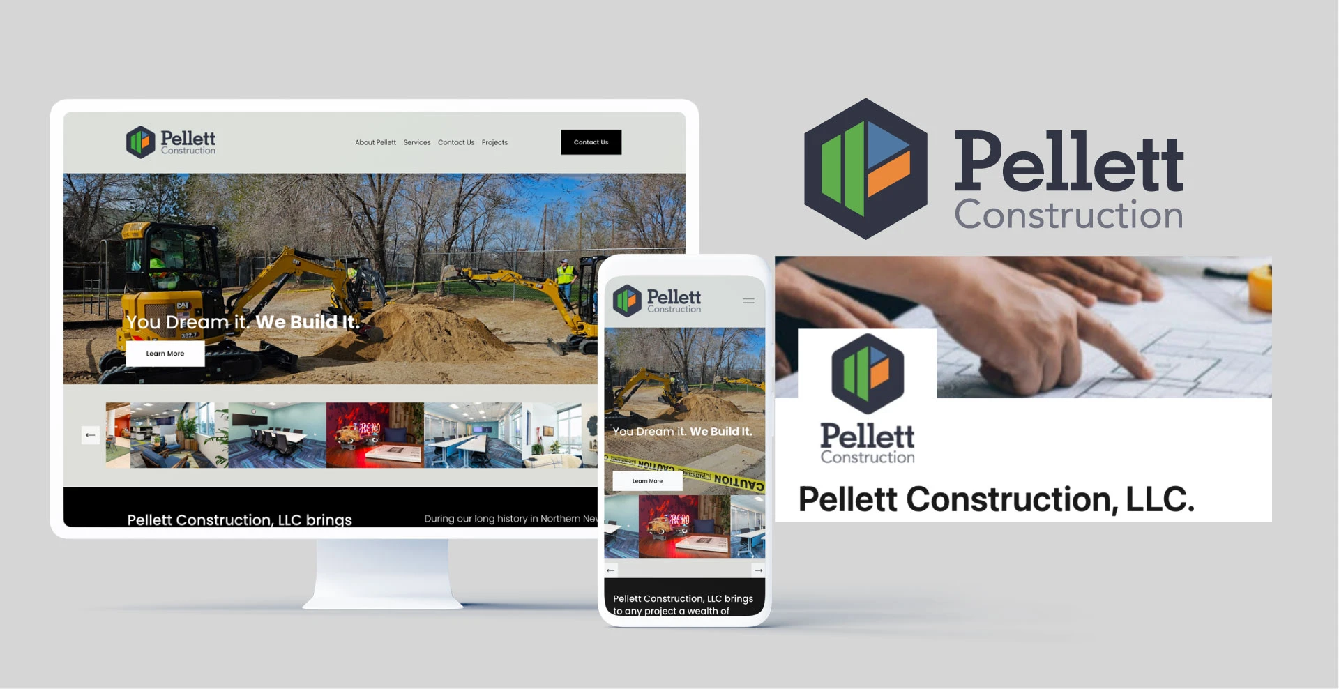
Building a brand as solid as the work itself
Pellett Construction, a full-service general contracting firm, has built its reputation through consistent execution, trusted relationships, and a commitment to doing things the right way, every time. As the company expanded its reach, the opportunity became clear: bring that same level of discipline and clarity to the brand itself.
This transformation focused on closing that gap. Aligning how Pellett looks, speaks, and shows up with how it actually operates at every touchpoint.
Anchored by a rallying cry that captures this mindset, Pellett is now positioned as a regional leader who’s known for what it builds as well as how it builds.
Developed by Miley Studios, a construction marketing agency focused on building brands for leading general contractors.

Brand Strategy & Brand Platform
One standard. Everywhere.
The brand platform gives Pellett a clear and consistent foundation. Not just visually, but operationally.
At the center is a rallying cry that reflects how the company works. It sets expectations internally and communicates standards externally.
Built together. Made to last.
Built together reflects how Pellett operates. Teams, partners, and clients working in alignment from day one.
Made to last speaks to the outcome. Not just the structures, but the relationships, the reputation, and the work itself.
Together, it defines both the process and the result. For the team, it reinforces accountability. For partners, it signals reliability. For architects, it reflects precision and respect for design intent.
Everything now points in the same direction. The way Pellett builds, and the way Pellett shows up.


Sizzle Reel
The work behind the work
A short, high-energy video that brings the Pellett standard to life.
The sizzle reel gives clients and partners a clear, immediate understanding of how Pellett operates. Not just what they build, but how they build it.
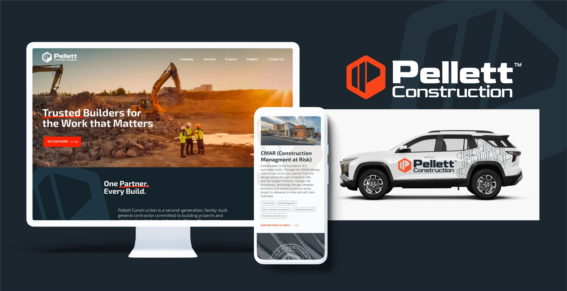
Logo Redesign & Explorations
Built to hold up. Everywhere.
The identity was designed to work where Pellett works—on jobsites, trucks, equipment, and in the field. Each concept explored structure, balance, and clarity, avoiding trends and industry clichés in favor of something more durable. The final direction is confident and direct, with a mark that reads clearly at any scale and reflects the strength and discipline behind the company.
Explorations
New Logo
Color & Typography
Built to be seen.
Built to be read.
The visual system balances energy with restraint.
Orange brings visibility and confidence. Navy and slate tones ground the system in stability and trust. Neutral tones introduce warmth and materiality.
Typography follows the same principle. Strong where it needs to be. Clear everywhere else.
Together, the system is designed to perform in real environments. On signage, on screens, and on job sites.


Brand Applications
Built beyond the screen
The brand extends into the environments where Pellett operates every day. From jobsite signage to vehicle graphics, each application is designed for clarity, scale, and durability. High visibility without unnecessary noise. Everything works together to create a consistent presence. One that reinforces reliability, precision, and professionalism wherever the brand appears.


Pellett Photography
Nothing staged. Everything real.
The photography focuses on what matters. The work, the people, and the process.
The focus is on real environments, real teams, and real moments, showcasing the standards that define how Pellett operates on every jobsite.
From wide, architectural shots to detailed, in-progress imagery, the visual approach reinforces both quality and process. These assets are built to serve across marketing, recruiting, and business development, giving Pellett a consistent, credible visual language that aligns with its brand and strengthens its position as a trusted regional leader.


Pellett Portraits
The people behind the work
The portraits reflect the same standard as the projects—approachable, confident, and grounded in real environments. Each image presents team members as skilled professionals and trusted partners, putting a face to the brand and reinforcing that behind every project is a team that takes ownership of the outcome.


Pellet Swag & Business Systems
Consistency, carried through
The brand extends beyond marketing into everyday use. From apparel and jobsite gear to proposals and internal documents, each piece is designed with clarity and purpose. The result is a system that supports the team internally while presenting a consistent, credible image externally.


Pellett Website & Development
Built for how clients decide
The website translates the brand into a digital experience that is direct, structured, and easy to navigate.
Clear pathways guide owners, architects, and partners to the information that matters, with project work front and center, supported by strong visuals and concise messaging. The site functions as both a marketing tool and a business development asset—designed to support growth, reinforce credibility, and reflect how Pellett operates. The result is increased time on site, deeper engagement with project content, improved visibility for targeted searches, and stronger alignment between brand perception and project caliber.
